New Logos and Brand Refresh Reflect Growth, Resilience, and Community Connection
Mat-Su Health Foundation has debuted a refreshed brand identity, including new logos for the Foundation and its programs, Connect Mat-Su and R.O.C.K. Mat-Su. The update reflects the organization’s evolution and pivotal role in supporting long-term community health across the Mat-Su Borough. The project, initiated in 2023, was completed with input from community stakeholders and partners, as well as a dedicated refresh team composed of MSHF staff.
“Intentional time and passion were dedicated to translating our mission into a refreshed visual identity,” said Erin Messmer, Chief Communications Officer of MSHF. “Our updated look reflects the growth of our work and our place-based nature, and will continue to guide our role in the community as a Foundation, program partners, and a team committed to supporting a healthier future for the Mat-Su.”
The intensive process was guided by a commitment to mission and honoring the unique Mat-Su community. Each new logo draws inspiration from the natural environment and the values that guide the Foundation’s place-based work.
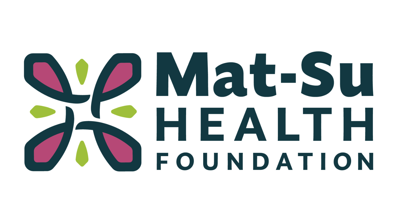
- The Mat-Su Health Foundation logo reflects resilience, steadfastness, and enduring impact. It is inspired by the ever-present fireweed plant, an integral part of Alaska’s landscape.
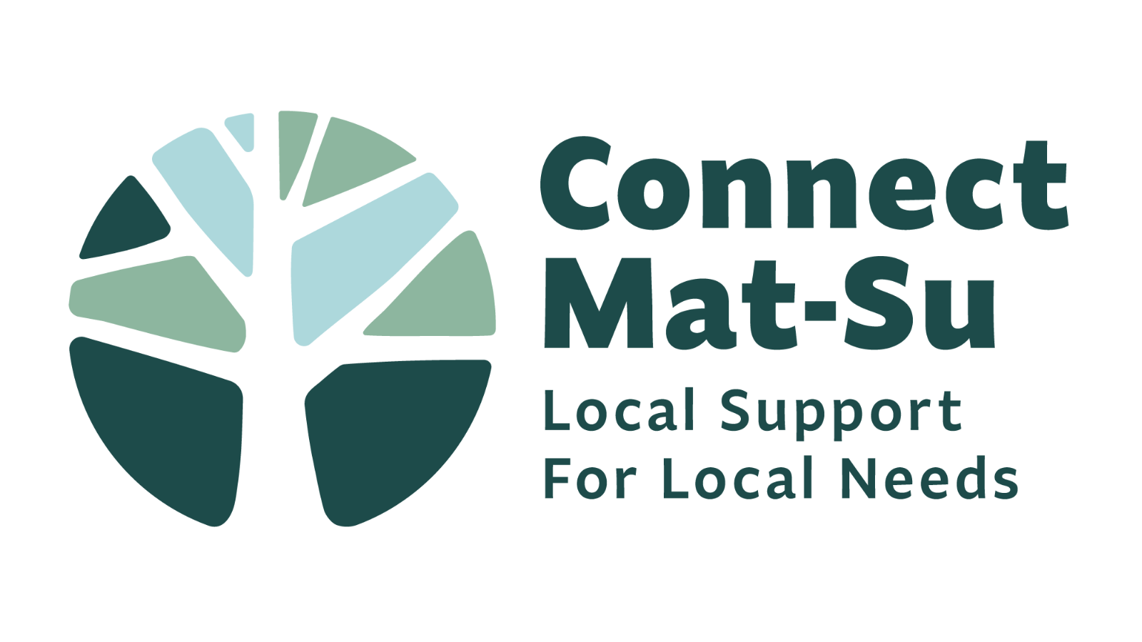
- The Connect Mat-Su logo, influenced by the trees that cover the Mat-Su Borough, emphasizes steadfast connection and access. It symbolizes how people, organizations, and resources create strong roots to help residents grow and thrive.
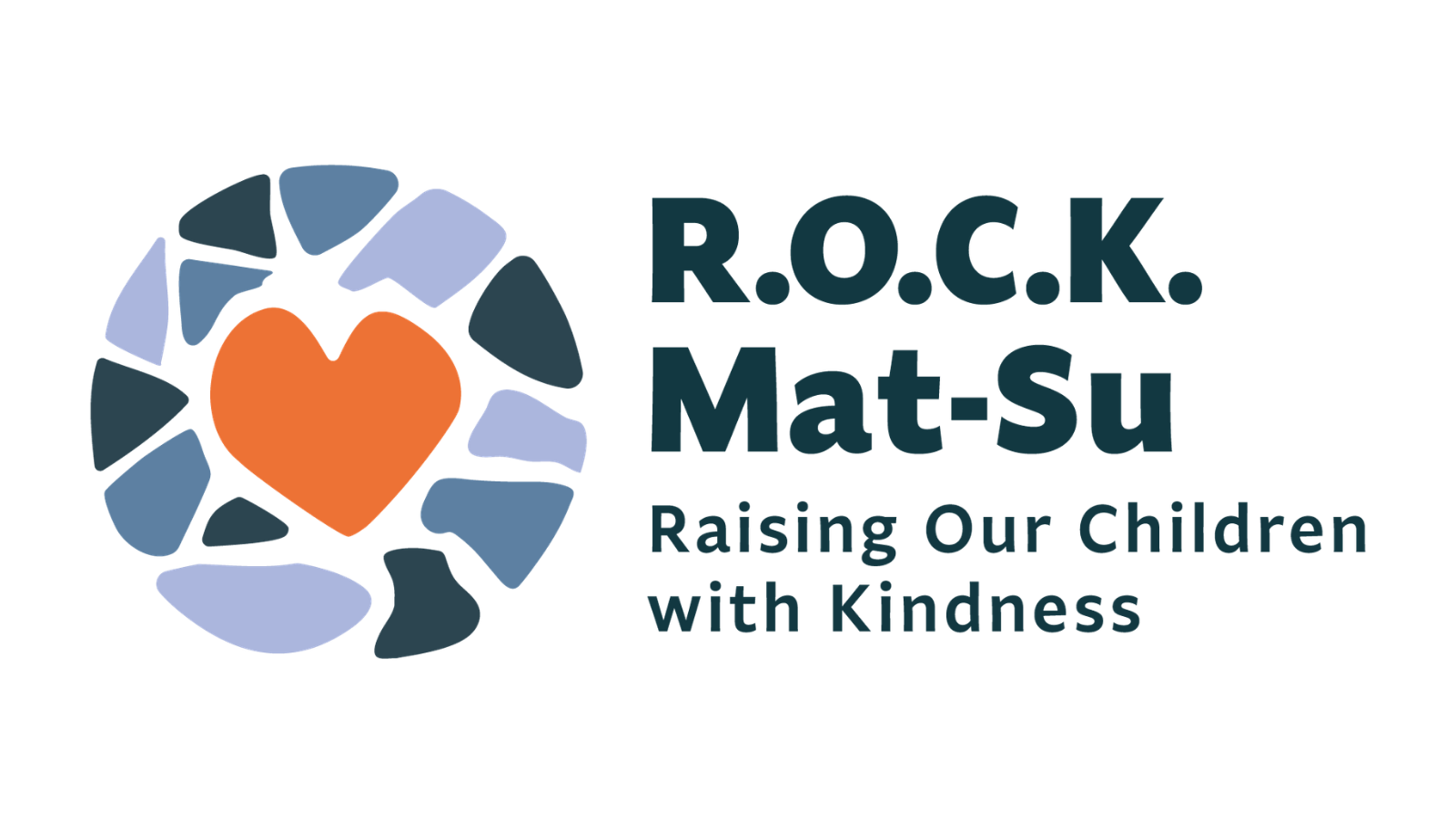
- The R.O.C.K. Mat-Su logo highlights collaboration and care. With the heart carried over from the previous logo, R.O.C.K.’s new mark reinforces the program’s focus on children, families, and collective impact.
The three refreshed designs were created as a cohesive visual system that is more modern, approachable, and adaptable, while holding fast to the Foundation’s mission and roots in the Mat-Su.
“Our work at the Foundation is deeply tied to this place we serve,” said Esther Pitts, President and CEO of MSHF. “Throughout this refresh process, we kept coming back to the importance of connection and belonging in our community. Our new logos and color palettes reflect the mission, vision, and values that guide every part of our work. Mat-Su is our home, and we are committed to helping it grow and flourish for all present and future residents.”
The new logos are now being rolled out across digital platforms, print materials, and community resources. Partners and stakeholders who need updated logo files or brand assets are encouraged to reach out. To learn more about the story behind the new look, visit healthymatsu.org/refresh. For logo requests or additional information, contact updates@healthymatsu.org.