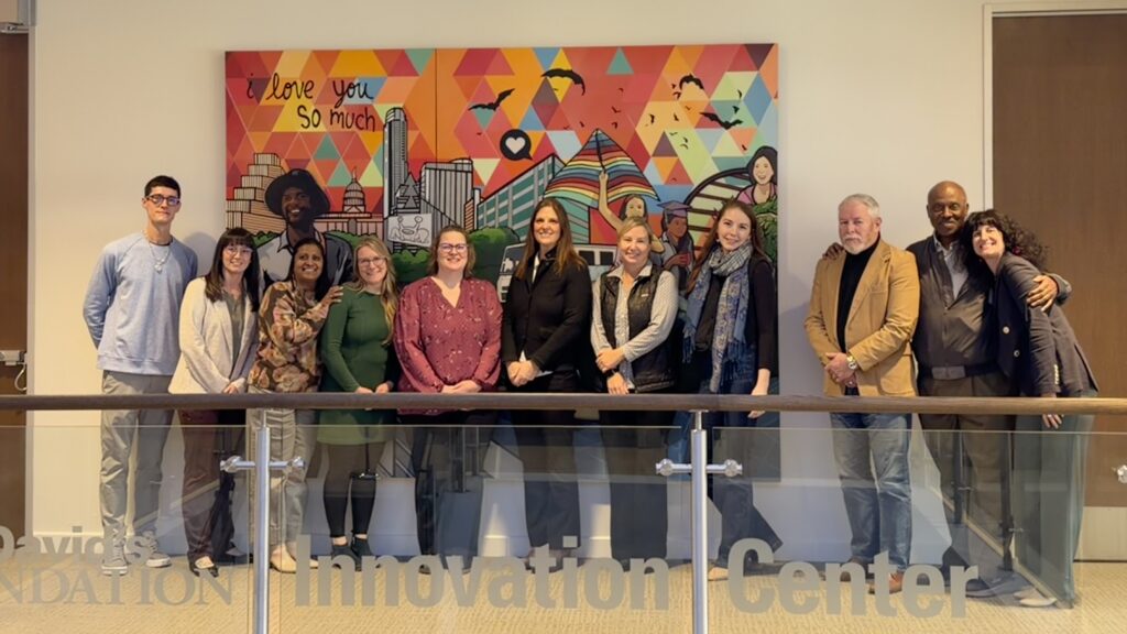
The Story Behind Our New Look
Over the last two years, we’ve invested time and care into refreshing our visual identity. This work began during a period of meaningful change for the Mat-Su Health Foundation: new leadership stepped in, our programs continued to grow, and we refined our focus on long-term community well-being.
As our organization evolved, it was clear that our previous brand no longer reflected the full scope of our work, or the strength of our partnerships. Updating our brands gives us the chance to represent ourselves more clearly as a Foundation, as programs, and as a team working toward a healthier future for the whole Mat-Su.
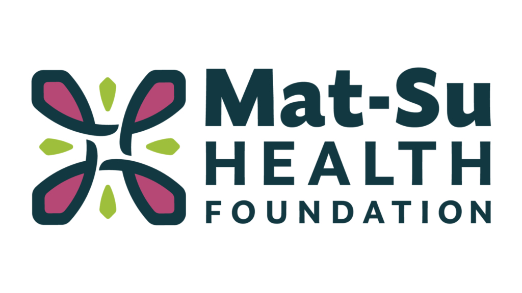
Perennial Strength: Fireweed is one of Alaska’s most iconic plants—resilient, beautiful, and deeply tied to the landscape. It returns every year, often blooming even after fire or upheaval. Just as different elements in nature have a way of indicating changes in the surrounding world, Alaskans often look to fireweed for signs of seasonal shifts: shoots in the spring after a cold winter; growth and near-bursting blossoms as summer nears; flowering as the fish return to the rivers, streams, and lakes; and finally, seed pods with fluffy hairs open for wind dispersal in the fall.
Carried by the breeze, seeds are able to take root where they land, growing into seedlings as the life cycle begins again.
‘Perennial Strength’ speaks to the enduring impact of MSHF’s work and the Foundation’s role in helping health and wellness take root across the Borough.
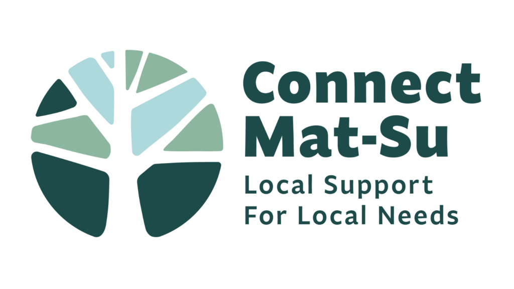
Branching Connections: The new Connect Mat-Su logo draws inspiration from the form of a tree, with its branches reaching outward to symbolize connection, community, and shared strength. Just as the branches support one another and draw from the same roots, Connect Mat-Su links people to the resources and relationships they need to thrive.
Taking inspiration from the previous mark, this version evolves the concept into a more modern, softer, and more approachable logo. The mark reflects the organization’s mission to nurture a healthier, more connected Mat-Su, where every individual has the opportunity to grow and flourish, supported by deep roots, a formidable trunk, and a network of branches that continue to grow.
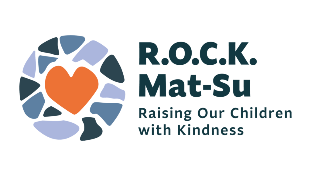
Collective Kindness: Individual pieces can come together to create a beautiful image when each element finds its place. This mosaic conveys the importance of each part in the whole, marrying diverse shapes in harmony surrounding a common center. Represented by the heart carried over from the previous logo, children and families remain at the center of R.O.C.K. Mat-Su’s work.
Reflecting the collaborative nature of the collective impact model, each piece of the mosaic surrounding the heart plays an integral part in creating the overall cohesive appearance of the mark. By bringing together these shapes, similarly to convening stakeholders for a common goal, hard edges become smooth as each finds its place in the system for change.